Definition Health

Author: The no-code tool for fast and flexible health questionnaire creation
Role Senior Product Designer (sole)
Team 1 x Senior Product Designer, 4 x Engineers, 1 x Senior PM
Date 2023
User ResearchPrototypingUI DesignDesign SystemsAccessibilityQA and Documentation
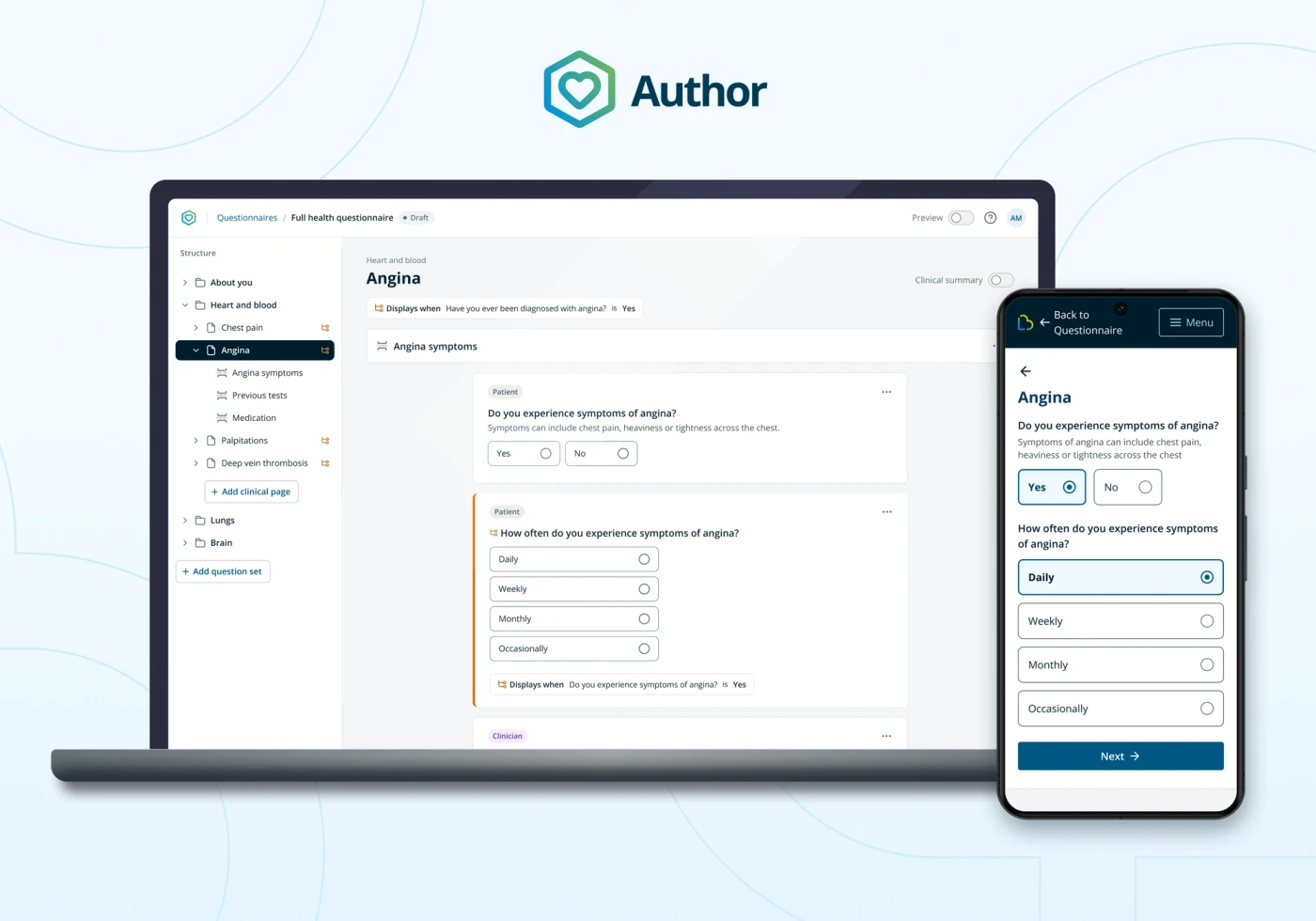
Mockup showing patient mobile experience and desktop author tool side by side

Impact

task_alt

Business can create any questionnaire it needs without added engineering cost

task_alt

50% faster completion time for patients with no health conditions

task_alt

Unlocked new clinical pathways beyond general surgery, e.g. Endoscopy

Story

Overview

Author is a no-code questionnaire authoring tool I designed for Definition Health, giving clinical staff the ability to build, edit and branch health questionnaires without engineering involvement.

I was the sole product designer on the project, working end to end from discovery — including an OOUX-based object-mapping exercise — through low-fidelity prototyping to high-fidelity design and delivery, alongside a product manager, four engineers and three clinical experts.

Author replaced a single, rigid questionnaire built on inaccessible third-party form markup (SurveyJS) with a flexible system supporting conditional logic, screening questions and reusable Lifebox design system components.

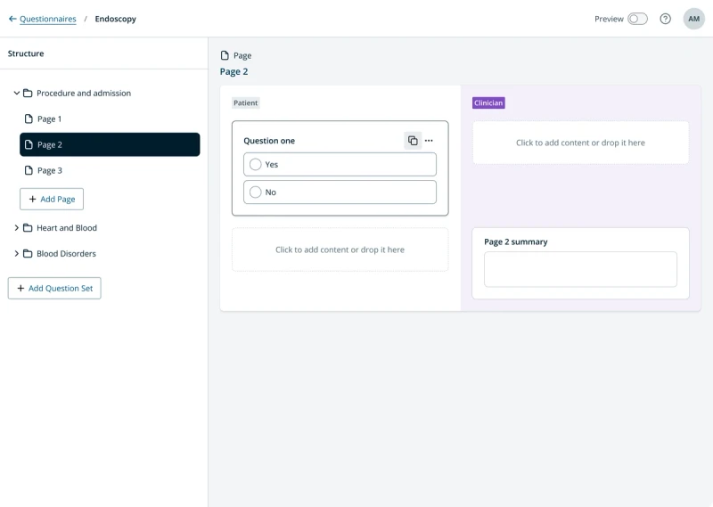
Mockup of a laptop showing the Author tool on screen. A left sidebar shows the questionnaire structure while a larger area on the right shows an editing canvas with a yes/no question

Author: a no-code editing tool for clinical experts to create health questionnaires

The Challenge

LifeBox's health questionnaire was a single, rigid survey designed for a general surgery pathway. It couldn't flex to hospital-specific policy, couldn't be safely extended without engineering time, and produced markup that fell short of our accessibility goals.

  • Missing commercial opportunities to serve low-complexity, high-volume pathways such as Endoscopy, since the questionnaire was built for general surgery only
  • Hospitals needed to adapt questionnaire content to their own local policy, which the single fixed questionnaire couldn't support
  • Adding a single question could take up to two sprints of engineering work, because questionnaire content was hard-coded
  • Questionnaires were built with SurveyJS, a third-party form builder producing markup that wasn't accessible — blocking our goal of WCAG AA conformance
  • Patients were complaining about questionnaire length and relevancy, with a measurable negative effect on satisfaction scores
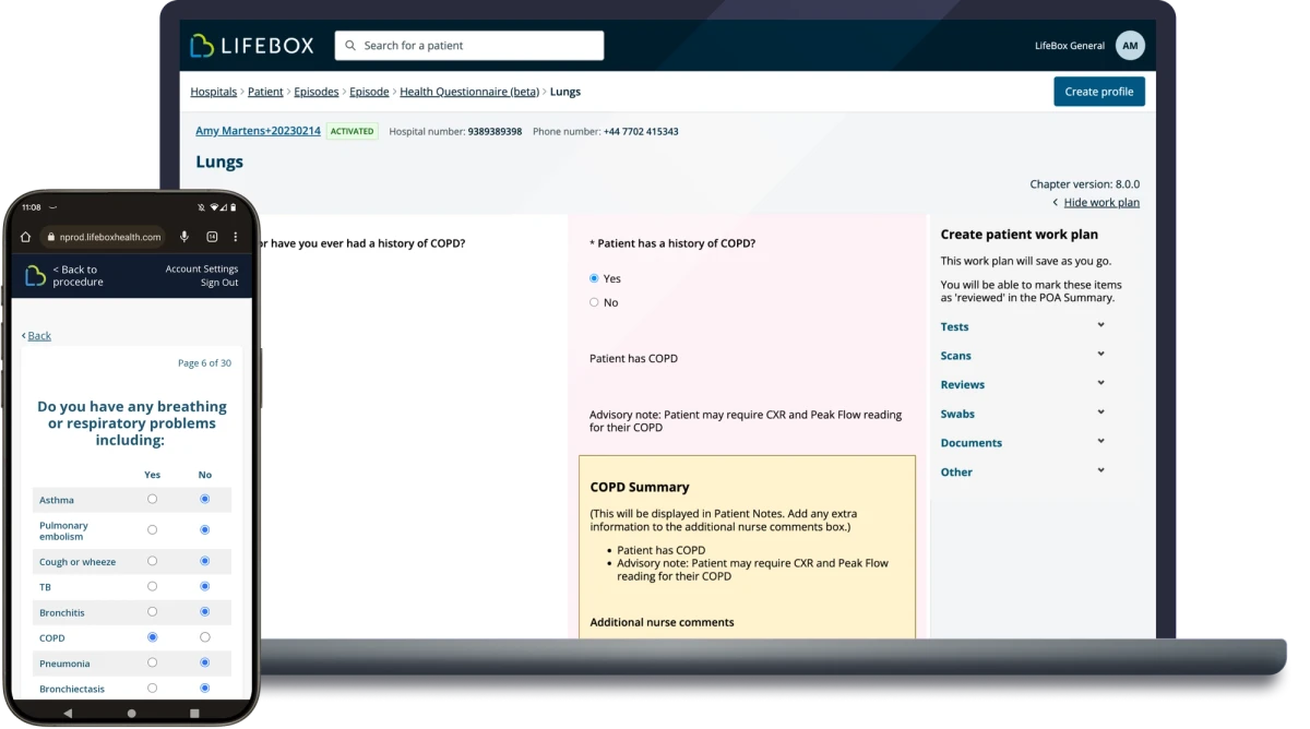
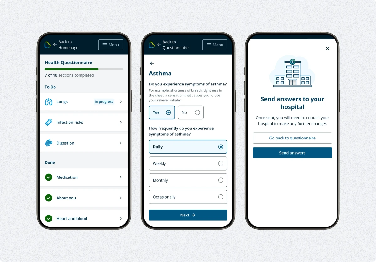
LifeBox features a questionnaire for patients to complete and an online platform for clinicians to manage their care

LifeBox features a questionnaire for patients to complete and an online platform for clinicians to manage their care

The Solution

Where Author started

Before I joined, Definition Health had already built up a strong collective understanding of the problems patients and clinicians faced with the health questionnaire — gathered through patient satisfaction surveys, support contact, hospital meetings, training sessions and an NHS audit. That knowledge fed into a company-wide Q&A workshop challenging the status quo behind the existing questionnaire, which I sat in on during my first day at the company, ahead of formally joining the Next Gen team.

Takeaways from that workshop shaped the brief I inherited: the business needed to produce multiple, customised questionnaires rather than one fixed version; content needed to be editable without engineering time; the circular navigation needed rethinking for mobile, accessibility and variable questionnaire length; and upfront screening questions were needed so patients only answered what was relevant to them.

The product manager mapped a MoSCoW prioritisation grid and the first story map, and engineering built an early proof of concept in Material UI to test technical architecture, before I joined the project full-time as product designer.

Screenshot of a web-based prototype of the questionnaire authoring experience

Engineering first POC from the early days of exploring Author

Breaking down complexity

I joined the project at this point as product designer, responsible for the questionnaire authoring tool. To understand what we needed, I wanted to dig into the data and relationships between the entities involved.

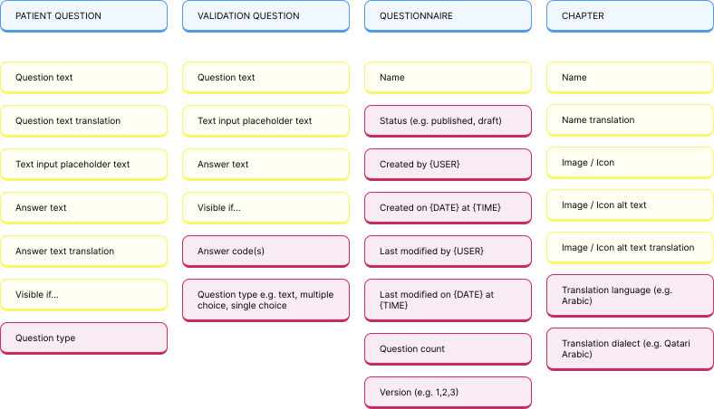
I'd recently completed a course on Object-Oriented UX (OOUX), a systematic approach to breaking down complexity by examining the "nouns" of a system — a good fit for a data-heavy, complex problem. The product manager and I worked through this while engineering continued experimenting. The output was an object map calling out objects, relationships, calls-to-action and attributes that could be translated into a user interface.

Sharing this map with engineering surfaced different assumptions across the team, which I dug into further with an alignment workshop exploring where we agreed and where we held diverging views.

With a clearer grasp of the data, screens and functions needed, I evaluated comparable tools — survey builders, form builders and workflow automation products — to find common patterns for handling similar problems, before applying what I'd learned to our own requirements.

A section of an object map with 4 objects arranged in columns - patient question, validation question, questionnaire and chapter. Attributes and calls to action are listed below each object

An excerpt of the huge object map to visualise objects and relationships in the system

Screenshot of a Miro board showing 6 yellow stickies with topics: onboarding, speed, re-usability, measuring success, representing logic and feeling confident. Under each one are sticky notes, each one representing a concept in that theme

Consolidating common elements from other authoring tools

Deciding how to show patient and clinical questions together

How might we make the difference between patient and clinical questions clear on the canvas without complicating the UI?

A questionnaire contains questions for both patients and clinicians — once a patient finishes, a pre-op assessment nurse "validates" their answers by reviewing them and answering additional clinical questions.

  • Patients shouldn't see the clinical questions, but clinical users needed to see both sets
  • In the existing system, clinical users saw both sets of questions side by side for context
  • Following NHS guidance, we wanted patients to have a step-by-step "one thing per page" experience, but clinical users needed density and context, so one *condition* per page worked better for them

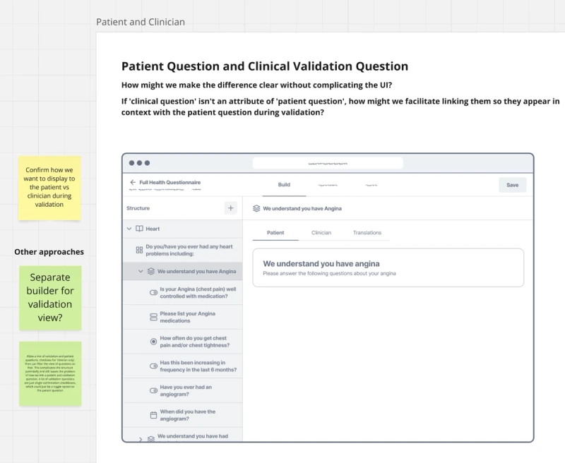
The first draft used separate tabs for patient and clinician content, but this made it hard to see patient and clinical questions in context together. A validation-view builder was considered next — letting Author users build the clinical view as it would render during validation — but this needed a side-by-side building tool. Our users mainly worked on 15" laptops and rarely used a second screen, and at a point where we needed to reduce front-end workload due to staffing constraints, a fully WYSIWYG two-column editor was too expensive for the return.

I settled on viewing clinical and patient questions together on the same page, each clearly marked as patient or clinician, built in a linear way. This didn't match the layout of the final output, but made the whole context of the page easier to see — and made conditional logic easier to implement later.

A low fidelity wireframe showing a tabbed editing canvas. one tab for patient and one for clinician

I dropped this as having to switch tabs would abstract too far from the finished layout

Mockup of patient and clinical questions being edited side by side in the Author canvas

I dropped this version as it would have required larger displays and more engineering time

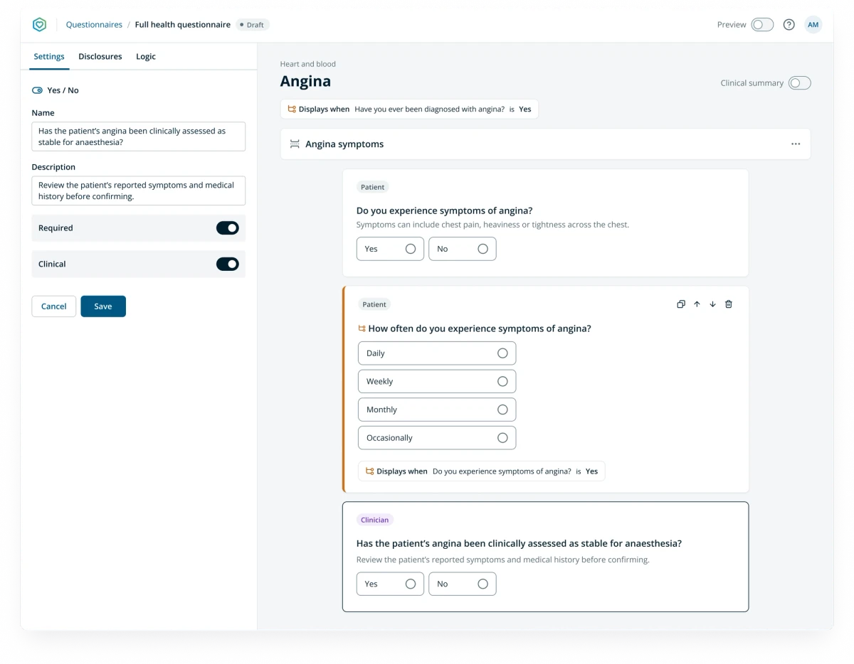
Screenshot of the Author editing tool with a mix of patient and clinician questions shown in the editing canvas.

Marking content as patient or clinician was clear enough for users and allowed them to see the whole section at once

Content design: reducing completion time with conditional logic

How might we reduce the time it takes for patients, particularly those with very few or no health conditions, to complete a health questionnaire?

We approached this from two angles: content design (only presenting relevant questions) and accessibility (ease of physical interaction, and not asking patients to re-enter information — a WCAG 2.2 guideline).

To improve relevancy, we needed conditional logic driving which questions appear. With input from our clinical team, I drafted requirements and produced a rough wireframe to collaborate on with engineers, including the ability to add conditions and rules to build up more complex logic.

Author also has a unique feature: medical statements called "disclosures" can be attached to any answer, so the same clinical fact can be derived from different questions depending on context. For example, one questionnaire might ask "Have you been diagnosed with Angina? [Yes]/[No]" with "Angina" attached to [Yes]; another might ask about it as part of a checkbox group, with "Angina" attached to that option instead. Either way, the patient's resulting medical document records it the same way.

I wireframed driving logic from disclosures directly, letting users search for a disclosure (e.g. "Chest pain") and test its value against a condition — but engineering judged the disclosure system too immature at the time, so we drove logic from questions and answers instead.

To keep the wider business aligned on scope, I broke the requirements down into levels of logic complexity, then checked them against the questionnaire the clinical team had designed for Endoscopy (lower clinical risk, shorter, less complex) — which could be mostly achieved with the lowest complexity layer. That gave us focus on what was actually needed for a first version.

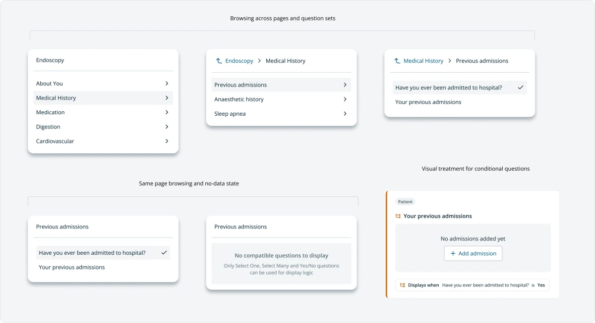
I designed a distinct visual treatment for logic-driven questions — an orange highlight and branch icon — since users already referred to the feature as "branching logic". To support screening questions (where patients pick conditions from a list to drive follow-on questions), logic also needed to apply at the page level, reusing the same settings-sidebar UI. I designed a Tree Browser component to navigate the questionnaire tree once logic meant looking across pages rather than within one — built flexibly enough to eventually navigate across question sets, with a click-to-replace popover pattern so the editor canvas is never obscured.

Screenshot of a component sheet showing different levels of the tree browser navigation

The Tree Browser component enables users to 'walk the tree' of the questionnaire structure to easily find what they need

Accessibility: rethinking the radio matrix

The hard-coded questionnaire used SurveyJS to generate form markup, which was often inaccessible. A key Next Gen goal was to eliminate that dependency by rendering our own components.

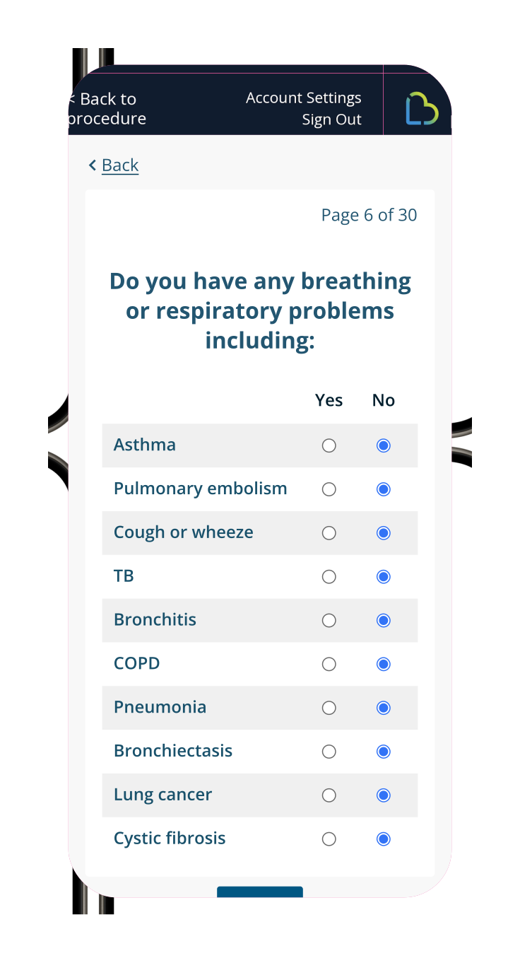
The radio matrix — multiple rows with radio labels as column headings — was our most problematic input: radios were browser-standard with a below-AA touch target size, and had no own labels (relying on column headings that scrolled out of view, forcing patients to remember or scroll back up to check which radio meant yes and which meant no).

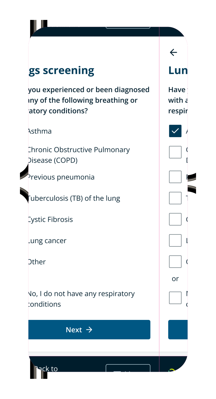
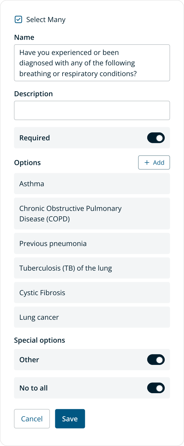
I eliminated this input type entirely, replacing it with a checkbox group with a "no to all" option at the bottom. This relied on a clinical decision to stop capturing explicit negative answers and only capture when a patient marks a condition present (or declares none) — judged clinically safe, and placing "no to all" at the bottom means patients scroll past the full list of conditions first. We added "no to all" as a special option in Author so the toggle logic is handled in the front end rather than being a repetitive manual task. Ordinary radios were also redesigned with large clickable areas conforming to WCAG 2.2 Level AAA target size guidelines.

Phone mockup with a page of the old Lifebox questionnaire showing. The question asks if the patient has any breathing problems with many rows of conditions and yes / no as answer options.

For healthy patients, having to select No for each condition was repetitive. For patients with conditions, the small radios were fiddly to interact with

A phone mockup of the Lifebox health questionnaire that shows checkboxes instead of the yes/no radio buttons for answer options

A new 'no to all' option made completion much faster for patients with no conditions. Enlarged checkboxes that met WCAG touch target size make it easier to select the right options.

Screenshot of the Author editor sidebar options for the select many component. Options are listed with special switches for no to all and other.

Managing the extra option consistently was made easy with a simple switch

Building the future: the Author UI kit

Engineering, design and the LifeBox design system evolved together throughout this project. Author's UI was kept as simple as possible for speed of development, reusing many existing design system components. Once the design settled, I built a UI kit for Author-specific components — combined with our core LifeBox libraries — so I could assemble mockups and prototypes more rapidly as we explored new features.

Feedback and testing

Throughout the project we had constant feedback from our end users — the clinical team at Definition Health — captured in a Miro board for future prioritisation. I completed hundreds of hours of QA, writing up bug tickets and feature specs in Jira to ensure the quality of the final product.

At this point, the team was preparing to begin UAT with hospital partners, following a positive reception to demos of the Next Gen capabilities, with further usability testing planned across the full flow — from chapter navigation through questionnaire completion to final submission.

Unfortunately, we didn’t get the chance as the company hit financial distress and went into administration. However, the Author IP itself was sold to a larger competitor who have since been working on bringing it to market.

The Outcomes

  • The business can create any questionnaire it needs without additional engineering cost
  • 50% faster completion time measured for patients with no health conditions, and 30% faster for patients answering in a way that triggers all mapped health conditions
  • Measurable improvements in accessibility, usability and responsiveness
  • Unlocked new business opportunities with the ability to serve diverse clinical pathways beyond general surgery
  • Anticipated reduction in patient complaints relating to questionnaire length and relevancy, once Author-built questionnaires go live
  • The Author IP was acquired by a larger competitor. Its value and potential was recognised as a worthwhile investment