
Increasing Wayflyer's conversion rate by 25% with redesigned onboarding
Impact

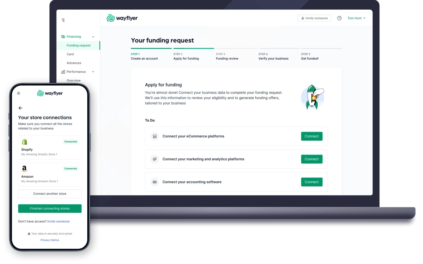
25% higher conversion across the whole sign-up and onboarding flow
38% lower support chat intervention rate
Customers with multiple stores and accounting systems could self-serve
Story
Overview
Wayflyer offers revenue-based financing to e-commerce brands and bases its funding decisions on data that customers connect, like their store, analytics and bank accounts. At the time of this project, nearly all customers came through outbound sales, with a salesperson guiding them through onboarding. To scale, Wayflyer wanted onboarding to work for inbound customers on their own, and to leave room for more products and markets.
I was the sole product designer on onboarding, working with a product manager and four engineers. Over 2022 I redesigned the flow so customers could get through it without staff, through a series of projects rather than one big release.
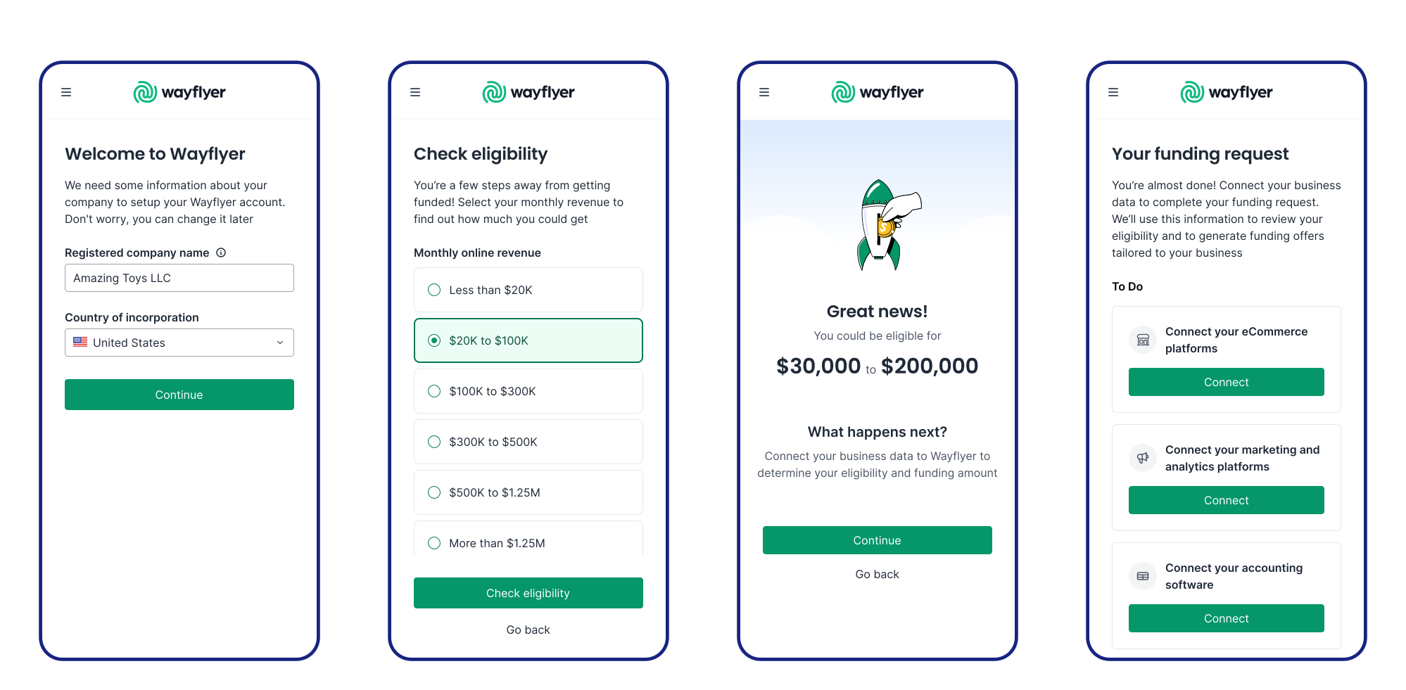
New steps in the onboarding flow. Asking for company of incorporation to help drive logic in further steps; asking users for their monthly revenue instead of how much funding they want so we can deliver value with an eligibility check and funding indication; a new checklist screen for more flexible onboarding and clarity for users over what's outstanding
The challenge
Built for outbound sales, the old flow stalled whenever a customer got stuck
Onboarding was a strict, step-by-step flow, and customers couldn't reach the app until they'd finished every step in order. That worked when a salesperson was on hand to guide them. Without one, a customer stuck on a single step, like a connection they didn't have access to, couldn't go any further.
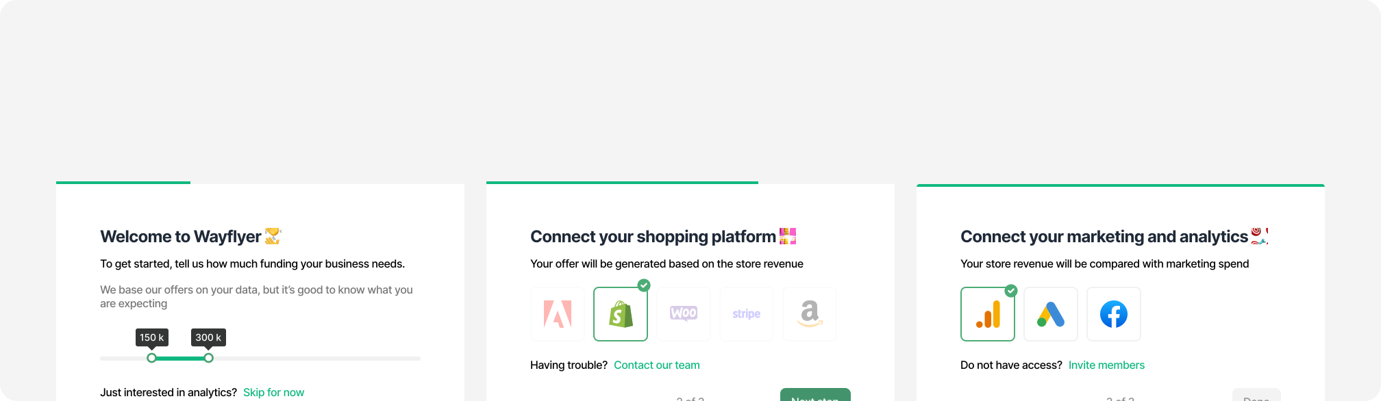
Research showed where customers got stuck
The product manager and I listened to sales and onboarding calls, reviewed Mixpanel and Hotjar data, read support chat transcripts and interviewed sales staff. The problems fell into five themes:
- One blocked step held up everything. If a customer couldn't connect something, they couldn't move on to the steps they could do.
- Setups we didn't support. Customers with more than one store had to create extra accounts, accounting connections happened outside the app, and bank connections only covered some countries.
- Effort before value. We asked how much funding customers wanted, when they'd rather know what they could get, and asked for a lot of work before they saw any sign of eligibility.
- Mobile. 25-30% of sign-ups were on mobile, and parts of the flow, like the funding slider, were awkward to use there.
- Trust and progress, on every platform. Customers weren't sure about Wayflyer or about connecting their data, and didn't know what was outstanding or whose move it was. So they turned to staff.
The solution
I prioritised each step with impact/effort matrices, then prototyped the whole flow
With the problems mapped, the PM and I scored the fixes for each step of the flow on impact and effort, so we could start with the changes that mattered most for the least work. I also studied onboarding from competitors and multi-product companies in other industries, and pulled out a few principles to steer the designs.
I then built a low-fidelity Figma prototype of the entire flow. It gave engineers and stakeholders a shared picture of where we were heading before we committed to any one piece.
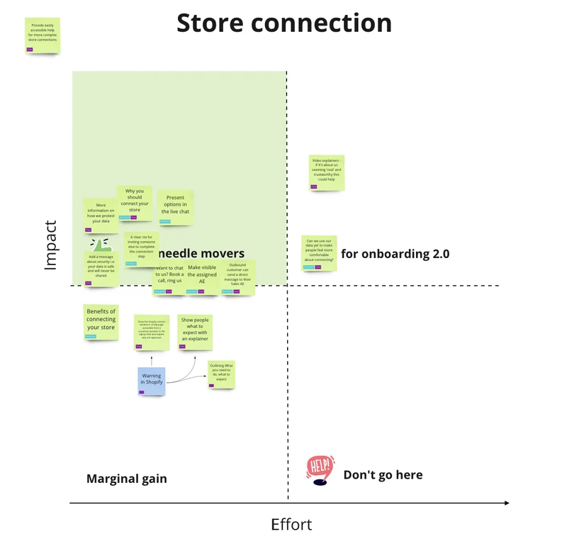
Impact / effort for store connection step
Asking for revenue, not a funding amount, gave customers something back
The old flow opened by asking how much funding customers wanted, on a slider that was awkward on mobile. I replaced it with a monthly revenue question using simple ranges, and showed an indicative funding amount straight after. It also told us who needed to connect accounting software. The accounting case study covers that part in detail.
One question up front routed customers to the right bank connector
Bank connections saved customers and staff the work of emailing statements, but only about 20% of customers connected. The old screen gave connecting and emailing equal weight, and didn't say which countries were supported, so some customers found out too late and had to go back.
First, a quick fix. I redesigned the landing page to make connecting the obvious choice and show supported countries up front, keeping the option to email statements behind a "country not listed" option. In usability testing, all participants successfully located the option, and once the change went live, more customers connected rather than emailed.
Then, as Basiq and TrueLayer were added to support more countries, it wasn't practical or necessary to show every supported country up front. I added a country of incorporation step at the start of onboarding. It gave underwriters useful information, and let the bank step pre-select the right country and connector in most cases.
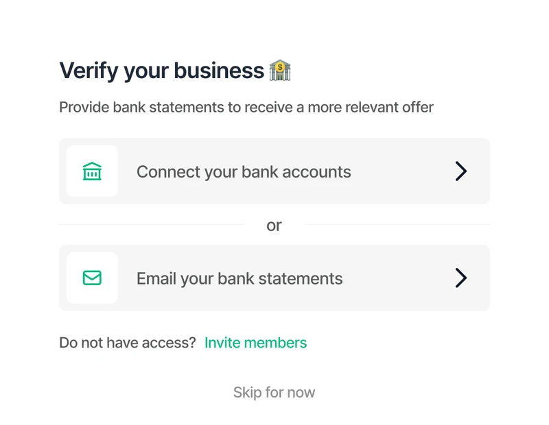
The existing bank step gave connection and email equal priority
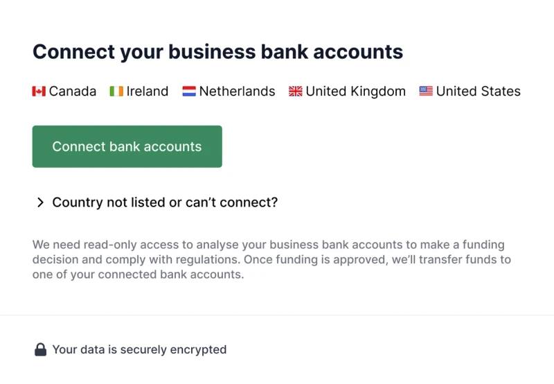
Supported countries listed and email statements moved into expander
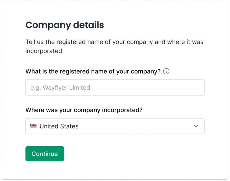
When we were able to support many countries, I switched to gathering country up front to configure the bank step
Customers could connect more than one store
Before, the flow supported one store per account, so customers with several stores had to create extra accounts. I designed a pattern for multiple connections, so they could add every store to one application and onboard without staff help.
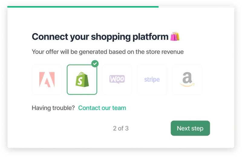
In the old flow, only 1 store could be connected
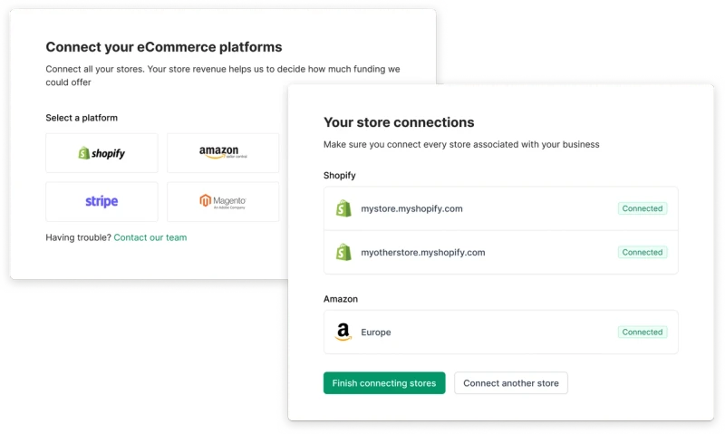
A new pattern ensured we could comfortably display more stores and allow the user to connect multiple
A checklist meant one stuck step no longer stalled onboarding
After three quick pre-qualification steps (country, monthly revenue and a funding indication), customers landed on a checklist and could complete the rest in any order. If they were waiting on a colleague for bank access, they could connect analytics in the meantime.
Company details were already ticked off when they arrived, an intentional nudge using the goal-gradient effect. Grouping items into To do and Done kept attention on what was left, and the checklist played back what they'd entered. It also gave Wayflyer's other products, like TikTok Ads funding and Insights, a natural place in the dashboard.
The outcome
Together, these changes raised conversion across the whole sign-up and onboarding flow by 25%, and cut the support chat intervention rate by 38%. Customers with multiple stores or accounting systems could onboard themselves, and several manual processes for Wayflyer staff went away as Wayflyer scaled after its Series B.
Onboarding was also where the design team tried out new ways of working, like unmoderated usability testing, Hotjar analysis and design critique. It's where I helped shape the emerging design system's components and patterns.
When I left, we were moving on to building trust, including letting customers manage and disconnect their connections.